PROJECT
Crittr - UI/UX
WORK
PROGRAMS
ABOUT
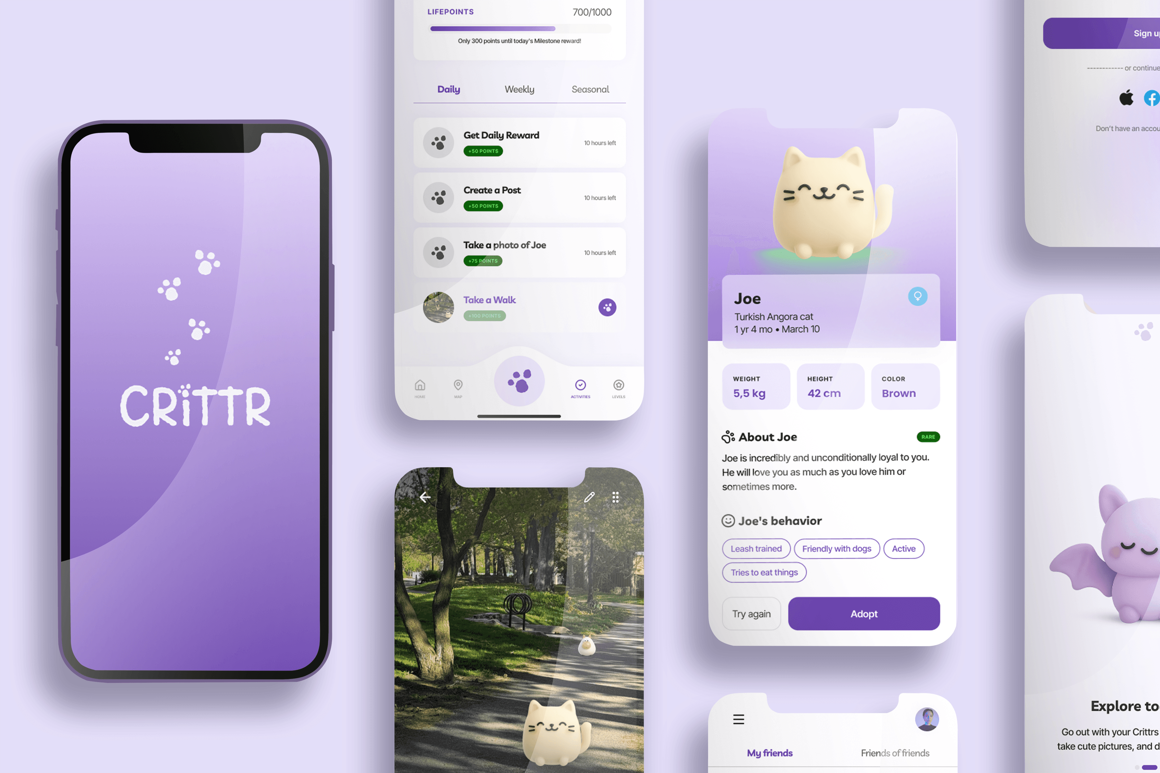
At Western Founder’s Network’s Product Design Sprint 2026, our team developed Crittr, an app that brings people together IRL with virtual pets. Crittr placed third at this hackathon and received the Curveball award.
YEAR
2026

Made in collaboration with Samriddhi Makasare, Princess Idul, and Preeti Narula
2016 vs 2026
The prompt for this hackathon was to bring back 2016, when social media was about connecting with IRL friends, and exploring its features with playful excitement.
People aged 16 to 24 are spending more time on their phones than actually going outside and spending time with friends. 57% of Americans feel lonely and younger generations like Gen Z and Millennials are lonelier than older generations despite being more digitally connected.
This begs the question: how could we encourage GenZ to spend more time outside and interact with the real world?
Research interviews:
Due to the short duration of the hackathon, we conducted casual interviews with 2 people who are in GenZ to find out more about their relationship with digital and IRL interactions with their friends.
Interviewee 1

“I need to spend less time on my phone, but the effort to plan a hangout is just so much higher than staying online.”
Ontario based second year university student
Click to see the next interviewee
User archetypes:


key pain points:
Staying inside and in the digital world is convenient, making the effort needed to go outside seem much higher.
Without a system in place, people rely on motivation to plan hangouts, which isn't sustainable.
People don't know who's available or nearby in the moment, making it hard to organize spontaneous plans.
People don't know what to do once they're out, which discourages them from going out at all.
research conclusion:
We found that people often want to go out and meet friends, but the process of having to plan a hangout, reach out to friends or choose something to do alone blocks these people from actually going.
Structural Design
Sitemap 1:

Low-fi Wireframes:
We then created wireframes based on our sitemap.

Sitemap 2:
After a meeting with a hackathon mentor, we realized we needed to lean more into the game aspect of our idea to motivate users to level up their pets and complete the tasks. As a result, we added the Levels tab, and moved the profile portion to the header of the home and activities page.

Design System and Branding
Aesthetic inspiration:
We created a moodboard that captured the essence of social media culture in 2016. It was marked by the iconic Instagram filters, and a time when social media felt more playful and authentic.


UI inspiration:
We took inspiration from games, learning apps, mindfulness apps, and even fitness apps for the look of the different features we wanted to include.


Based on the function and demographic of Crittr, we decided to go with a clean yet colorful UI, using purple as our main accent color as a reference to the visual aesthetic of social media in 2016.
branding and style guide:

Prototyping
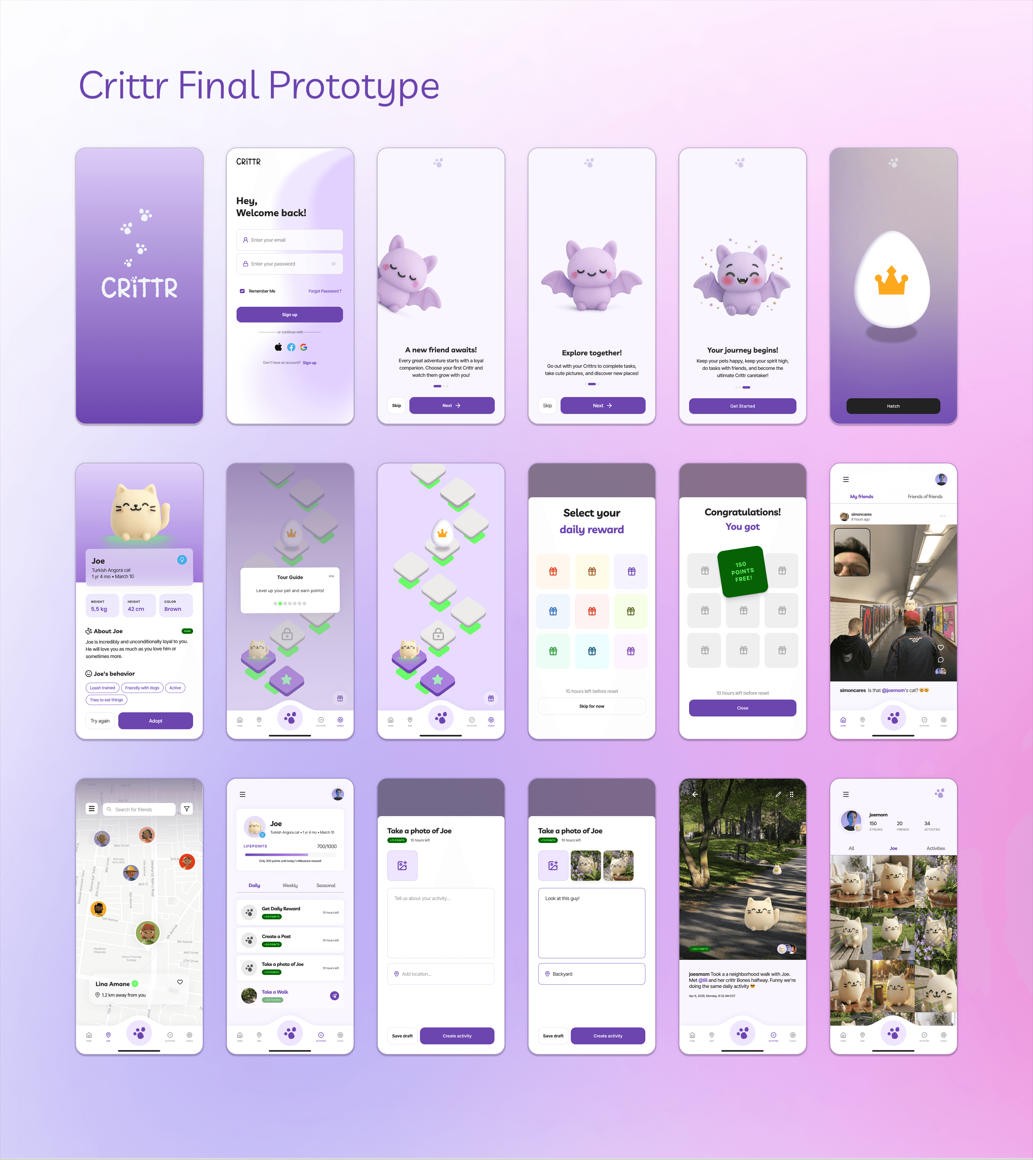
These are the core features in our final prototype:
Friend Feed and Map: Discover location and activities of friends
Daily activities and Activity Posts: Provide structured tasks and share with friends
Profile Album: View photos of virtual pets and adventures taken together

Interactive prototype:
Conclusion
Since the Western Founders Network Product Design Sprint only lasted 1.5 days, we were working with very limited time. One of the most important takeaway for me was how important it was for the team to align on a vision. We spent a lot of time brainstorming the initial approach and ideas, but once we were all happy with the vision, creating a prototype according to our set branding system was a fast process.