
PROJECT
Apple A Day - UI/UX
WORK
PROGRAMS
ABOUT
Apple A Day is an app that turns fitness into an encouraging, structured experience that is personalized and social. It aims to reframe exercise as an achievable and flexible part of daily life, turning fitness into a natural extension of everyday routines.
YEAR
2026

made in collaboration with Kyra Reilley and Claire Zhou
Hana wants to start going to the gym.
But she is a busy college student adapting to their senior year schedule.
She wants to fit time in for the gym, but she has to study for exams, attend weekly crocheting club sessions, and work shifts for the campus cafe.
Even when she finds time to go to the gym, she's not sure what workout to do, how to use the equipment, or whether her form is right.
All these anxieties stop her from starting her fitness journey at all.
what if Hana could:
Find curated exercise tutorials for her fitness goals
Easily document her progress to stay motivated and consistent with fitness
Connect with other people interested in fitness, turning it from a solo to a group activity
User Research
wellbeing priorities survey:
20 college students were asked to rank wellbeing priorities. One ranking was for how they prioritized these aspects of wellbeing now, and one for how they wished they prioritized it instead.
Priorities that were considered more important were ranked lower (closer to 1), and priorities that were considered less important were ranked higher (closer to 4).

The results showed that currently, they priorities productivity over other facets of wellbeing, while prioritizing diet least. Notably, in their ideal worlds, the students wanted to prioritize fitness over productivity and diet, which were ranked the lowest.
Research interviews:
We also conducted two interviews with current college students asking about their fitness and exercise habits.


Persona:

How might we:
How might we reduce the psychological and practical barriers to fitness for busy college students and young professionals so that exercise becomes a comfortable and sustainable part of their routine?
landscape analysis:




We researched both direct competitors (fitness apps) and indirect competitors to identify the gaps in the market, and found the follow key points:
Fitness apps like Keep and Hevy provide data tracking, community features, and fitness tutorials, but involves many features that might overwhelm fitness beginners
Note-taking apps like Notes app offers flexibility, but does not provide guidance and structure for fitness beginners
Video apps like Youtube or Instagram include a large range of different fitness tutorials, but finding the right one can be overwhelming for fitness beginners, and is more helpful for a one-time workout rather than building a healthy lifestyle
Habit tracking apps like Dailybean are great for creating consistent routines and building healthier habits, but is not for fitness and mainly for tracking general habits and mood
What's missing? An encouraging, structured experience that is personalized and social.
Positioning:

"An apple a day keeps the doctor away."
Small daily actions build long term health.
Apple a Day is an encouraging and structured experience that is both personalized and social, helping users create consistent fitness habits.
Structural Design
Sitemap:

Storyboards:
Our team also made storyboards to clearly define what features we wanted to focus on, and the contexts in which our users would use our app.

Low-fi Wireframes:
We then created wireframes based on our sitemap and key features. Key flows include:
Logging workout flow
Video tutorial lookup flow
Community browsing flow

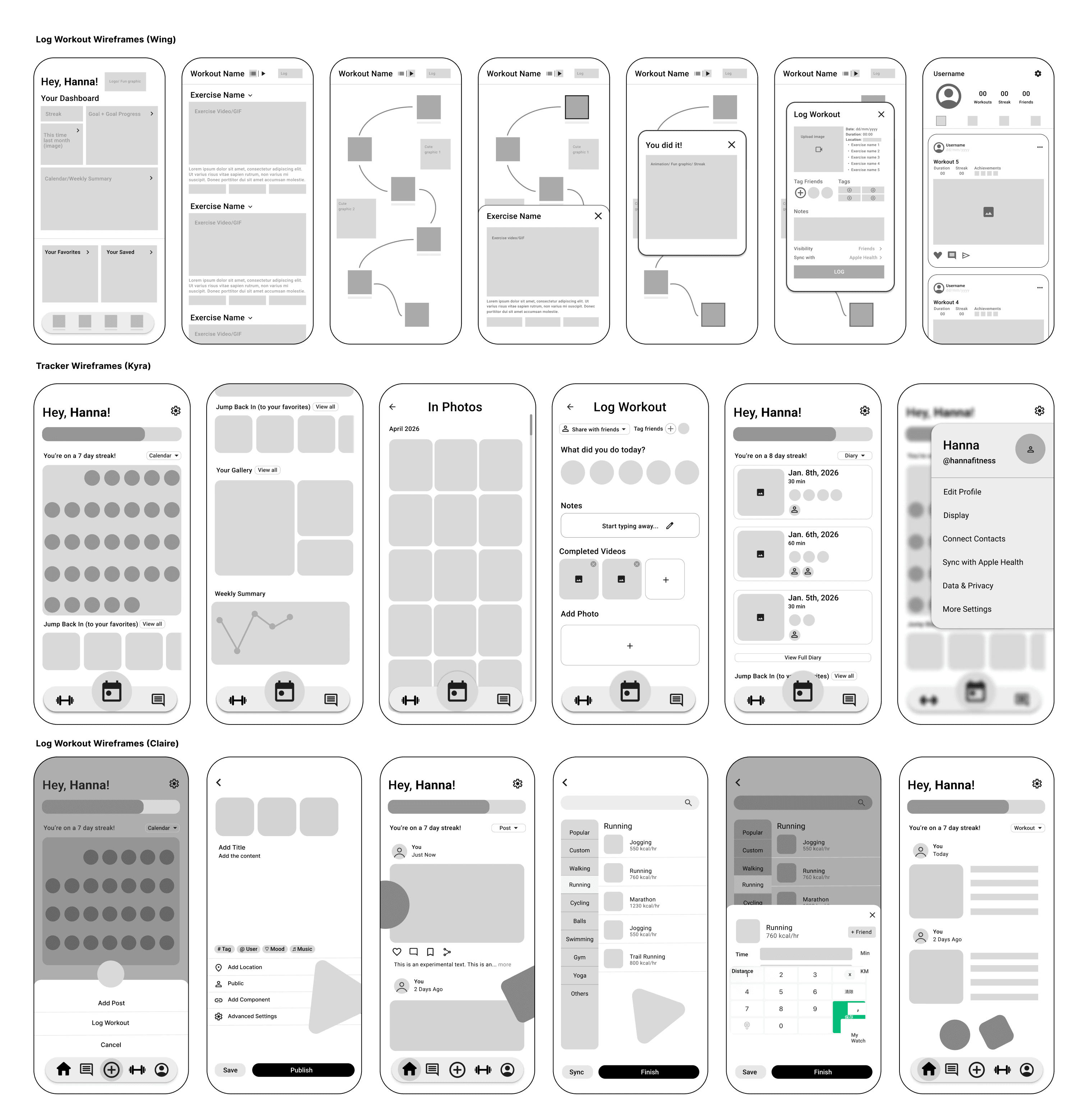
Workout logging Iterations:
Based on our initial lo-fi wireframes, we all iterated on the workout logging flow as we had the most trouble figuring out how we wanted that flow to look.
Design System and Branding
For this project, we used other UI designs as inspiration for what visual direction we wanted to head in. We narrowed down what we liked from our references to these few points that we wanted in our app:
Rounded corners
Minimalist icons
White background + few colors
Cards

design system:
Based on the user needs we identified in the research phase, we wanted to make sure our app looked friendly, playful, and encouraging. However, we realized that some users associated this color combination with easter, and we also had trouble making the screens cohesive with so many colors.
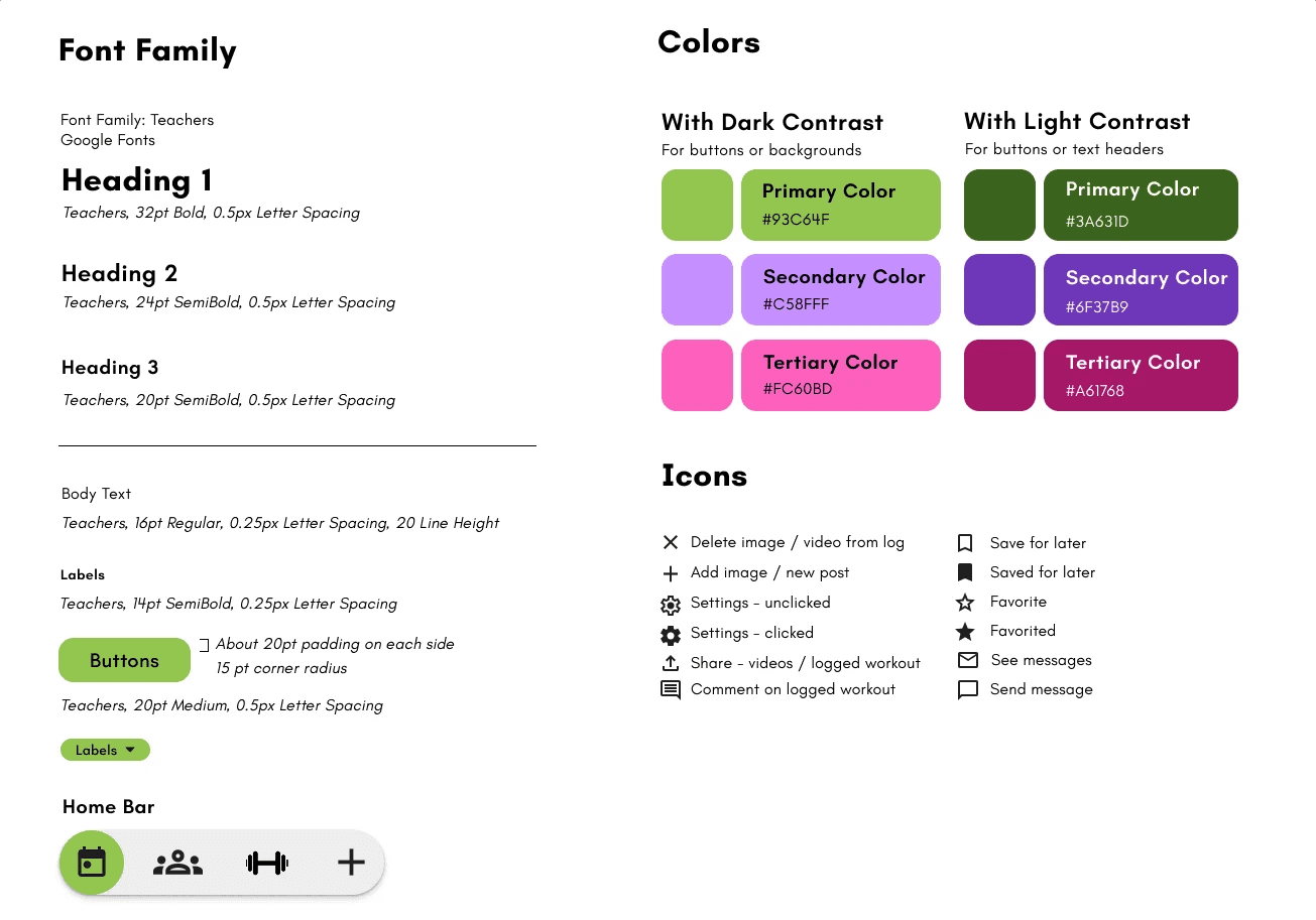
After iterating on our high-fidelity wireframes and realizing that the previous design system didn't quite work, we pivoted to this new design system that I made. The cream background was more harmonious with the green, and still looked friendly, encouraging and calm for users.

Design Process
Hi-fi Wireframe iteration 1:
Using our lo-fi wireframes and our design system, we created our first iterations of hi-fi wireframes for our key flows.

User Testing:
The main feedback we got about the visual design was that the color scheme felt incoherent, and the different flows didn't feel like part of the same app because the colors were so different. In addition, some people were also confused about some of the features, and some expressed that they wouldn't want their fitness app to constantly track their location for safety.
Hi-fi Wireframe iteration 2:
Taking the feedback we got from our first user tests, along with the redesigned color scheme by me, we made our second high-fidelity iterations.
Weekly Challenge and video tutorial lookup flows by me:

Community flow and diary flow by Kyra and Claire:

Hi-fi Wireframe iteration 3 (By me):
I then iterated further on all of our screens, removing some redundant features and polishing the layout for some sections of the app like the diary, feed, and post views.


Final Prototype

Clickable Prototype:
Conclusion
Apple A Day was a longer project where we did in-depth research and iteration over four months. With the extra time we had for research, our team realized the importance of positioning, finding a market niche, and understanding the feelings and behaviors we wanted our app to evoke for our users.
Additionally, my biggest takeaway is also the importance of good user interviews and user testing, as it highlighted joy points and pain points that might not be obvious initially, helping us find the places that needed improvement easily.